There's more choice available now, but when I began work on my garden, trellis and fence panels usually came in the standard woodstain, a rather orangey colour. Nothing wrong with that in itself, but in my garden, where everything else looks well-worn and faded, I've repainted or restained all the trellis we've bought or made. The one piece of trellis I put up 'au naturel' (ie not natural at all, but that orangey colour) stood out so obviously as an 'intruder'.
Grubby greens and quiet greys
I've seen enough make-overs featuring purple fences to know that 'brightening
things up' has been well-covered elsewhere. So I'm quite happy to promote
the merits of grey, olive green, and other mucky shades for painting fences,
trellis, garden furniture.
This sounds depressing, but isn't, I don't think, if you plant attractive
things against it. Muted colours can form a more sympathetic background
to plants, in that they fade into the background, letting the plants play
the leading role.
My garden is so obviously attached to the back of an old house, and has so obviously been part of the landscape for over a hundred years, that I felt I should go with that and not introduce anything obviously 'modern'. Even the plastic watering can looks out of place.
Toning down orange pots
I've bought many of the bargain terracotta pots. Again these are always a standard stark orange colour. I often paint these as well, mixing up a water-based paint colour, from a few tester pots of emulsion, with artist's acrylics, thinned down with water, and painted on or wiped on with a rag. Again, usually grey, or cream. The paint tends to wear off in time, but by then they're nicely weathered and so it doesn't matter. I guess if I wanted to keep the paint colour looking bright, I'd have to varnish them after painting, but that seems like far too much bother.
Using bright colours carefully can look brilliant, if its used to highlight something like a seat or a pot, or some other focal point. Bright colour in larger areas can look good in the right setting. But I know that my garden would look terrible, for example, if I painted purple the piece of fencing that separates 'Woodland Corner' from next door's garden. The fence there, though possibly due for replacement, has faded to a quiet grey, and is perfect simply because it's so unobtrusive.
While I'm talking about paint, I also have to mention Farrow and Ball. Farrow and Ball do a lot of historic colours well suited to gardens. Even before I bought anything from them, I loved their paint simply because they had colours called "Pigeon" and "Downpipe". Just class.
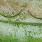
Above: Terracotta pot, originally painted pale blue-grey,
now weathering nicely.
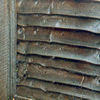
Top left: A lovely, grubby, weathered bit of fencing. It would be a crime to paint this purple.